Localizing a layout is not simply a matter of replacing the source text with its translation. Producing a document that reads well, follows local typographic conventions, stays true to the original brand guidelines and is ready for print or distribution takes a great many adjustments.
Moving from one language to another raises a wide range of technical challenges that can break a layout and undermine perceived quality in local markets. Here are a few of the points that premium localization has to get right.
Depending on the language, translated text can run much longer or much shorter than the original. The same content may grow considerably in German or Russian, for example, and shrink in Chinese or Japanese. Expansion can push text out of its frames and hide it, while contraction can leave large gaps that throw the layout off balance. The whole document then has to be adapted so that it stays graphically consistent with the source while remaining readable and balanced in the target language.
fr
de
ru
ja
The same instruction page, from English into German
en · source layout
Installation
Before first use, check that the seal is correctly seated in its housing, then tighten the union nut by hand as far as it will go. Do not use any tools. Check the seal before every reassembly and replace it as soon as it shows signs of wear.
Fig. 1 — Assembly order
de · the text overflows its frame and runs over the diagram
Inbetriebnahme
Vor der ersten Inbetriebnahme prüfen Sie bitte, ob die Dichtung ordnungsgemäß in ihrer Aufnahme sitzt, und ziehen Sie anschließend die Überwurfmutter von Hand bis zum Anschlag fest. Verwenden Sie hierfür keinerlei Werkzeug. Überprüfen Sie die Dichtung vor jedem Zusammenbau und ersetzen Sie sie, sobald sie sichtbare Verschleißspuren aufweist.
Abb. 1 — Reihenfolge der Montage
Typographic rules
Every language has its own conventions. Punctuation, hyphenation, spacing around punctuation and quotation marks all follow rules specific to each language.
A few examples
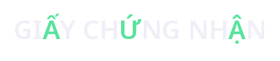
vi · tone mark and vowel mark
vi · diacritics in capitals
es · opening marks
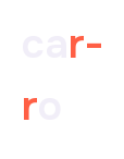
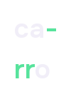
es · digraphs and hyphenation
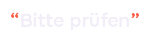
de · quotation marks
de · ß in capitals
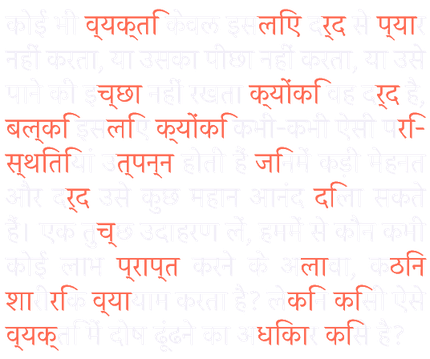
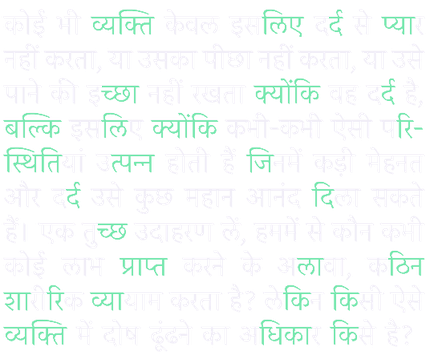
Devanagari: combining characters and placing diacritics
In Devanagari, characters can be combined incorrectly and diacritics misplaced: before, after, above or below the consonants they belong to.
broken ligatures, misplaced matras
conjuncts formed, matras in place
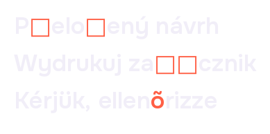
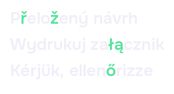
Central European diacritics
incomplete font or wrong substitution
font with the right glyphs
Turkish capitalization: işlem
default Latin rule
Turkish rule (i → İ)
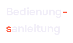
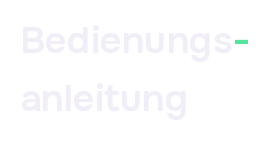
German hyphenation: Bedienungsanleitung
hyphenation dictionary not applied
German hyphenation
Right-to-left scripts
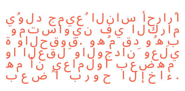
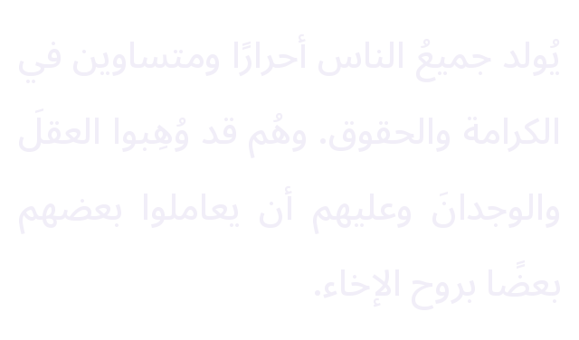
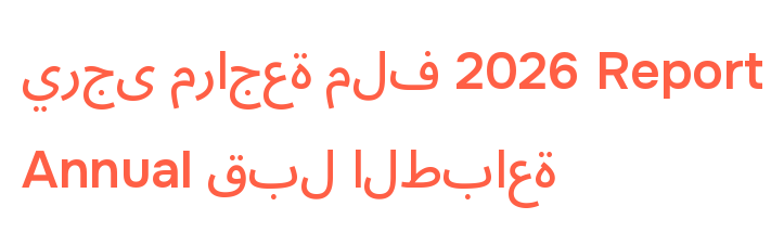
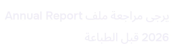
Localizing a layout into a right-to-left language (Arabic, Hebrew, Persian, etc.) calls for substantial technical work. It is not just the page order that must be reversed, but also the arrangement of each page and the direction of every text block. Images with no inherent orientation are mirrored; those that would lose their meaning if flipped (clocks, handwriting, etc.) cannot be: the challenge is then to find the subtle adjustment that preserves the logic of the master AND produces a consistent, faithful result in the target language. Once the mirroring is done, fonts must be substituted, kashidas adjusted, GREP styles created so that embedded Latin text stays visually consistent with the source art direction, and numerals adapted (Western or Eastern Arabic numerals, Persian numerals).
Arabic without proper handling
letters disconnected, order reversed, justification and leading not adapted
joins, reading direction, justification and leading adapted
Hebrew text without proper handling
Character order lost
Character order restored
The main challenge of right-to-left (RTL) layouts lies in handling mixed content. RTL texts frequently contain segments in Latin script: proper names, numbers, technical terms or English words. These read left to right within text that runs in the opposite direction, which creates tricky layout situations, especially at line breaks. Without rigorous handling, Latin segments can break in the wrong place or disrupt the reading order of the paragraph, causing reversals or visual inconsistencies.
Arabic with an embedded Latin segment
letters disconnected, order reversed, Latin segment split and moved
joins, reading direction and Latin segment preserved
RTL layout therefore demands particular attention and precise technical skill. There is no room for approximation.
CJK scripts
Chinese, Japanese and Korean (CJK) writing systems impose specific typographic and composition constraints. Western fonts must be replaced with CJK fonts that have the appropriate glyph sets and metrics for ideographs.
Handling CJK text relies on dedicated features such as Japanese composers, kinsoku shori rules (characters not allowed at the start or end of a line), mojikumi (character spacing), furigana or ruby (pronunciation guides with very specific placement), character grids, and more.
Chinese
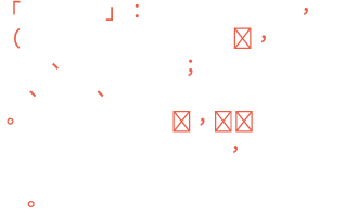
Traditional Chinese font applied to Simplified text, no proper handling, missing glyphs, punctuation pushed to the start of lines
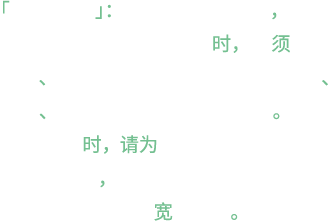
font, kinsoku and paragraph settings adapted
Simplified and Traditional Chinese: two versions, two character sets
the wrong font can change the characters
Mainland China, Singapore
Taiwan, Hong Kong
Japanese
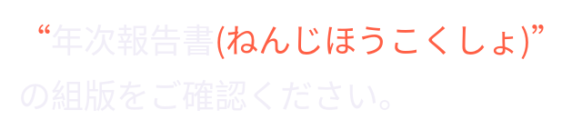
wrong quotation marks, ruby not positioned
Japanese quotation marks, ruby above the kanji
Compared with Western languages, text expansion is generally negative: a text translated into Chinese, Japanese or Korean often takes up less space. Ideographs, however, need a larger point size to remain legible, which often means a complete overhaul of the type styles. Visual hierarchy, leading, indents, spacing and sometimes even the layout grid must be adjusted to keep the different language versions graphically consistent.
CJK localization may also require adapting language-specific punctuation, text orientation (horizontal or vertical), line-breaking and justification rules, and certain graphic elements to match the editorial conventions of each language.
Numbers
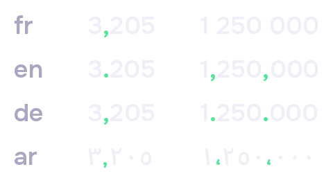
Numbers follow different conventions depending on the language. Some languages use their own numeral systems (Devanagari, Arabic, Khmer, Thai, Chinese, etc.), while others simply use different decimal and thousands separators.
For example, 3.205 in English becomes 3,205 in German. Leaving the punctuation unchanged can alter the value completely: with the point left in, the English “three point two zero five” would be read in German as “three thousand two hundred and five”!
In financial documents and annual reports, these critical elements require particular care at the layout stage.